Virginia Oaks, 2020
Redesigning a housing website for low income residents
My role
UX Designer
Skills and tools
Figma, Miro, Wix
Problem space
Real estate
Duration
2 months
Overview
About Virginia Oaks
This summer, I had the opportunity to work on a team of five to redesign the website for Virginia Oaks, a housing complex specialized for low income and second chance residents. We were tasked with improving the visual branding to increase online traffic and in-person visits.
What I did
As one of the UX designers, I iterated design flows and prototypes, with an emphasis on information architecture and accessibility. I worked closely with my team to conduct user research and implement the final website.
Problem statement
Virginia Oaks, a low income apartment complex, has been stagnating in visits to the property due to the onset of COVID-19. The client came to us with the request of redesigning their website on Wix to increase foot and online traffic. Specifically, they wanted the website to be easy to use and visually appealing for folks with less technology experience.
🎯 Our goal
Use UI/UX techniques that are easy to implement in Wix to reduce information overload and structure the site to guide users to move beyond the home page and apply for the apartment.
Discovering areas for growth
Examining the current website and client goals
A couple of key points from our kick-off meeting with the client guided our next steps for research. First, we were to focus on building the website for apartment seekers, not current tenants. Second, we were designing for people with low technology literacy in the low income bracket in McKinney. We also had some constraints - we were not allowed to include any pricing details, we were only able to build in Wix, and we had to start with the desktop designs.
Based off of the statistic that 26% of adults living in households earning less than $30,000 a year are “smartphone-dependent” internet users, we found it necessary to optimize the website for mobile as well, which we kept in mind as we created our prototypes.
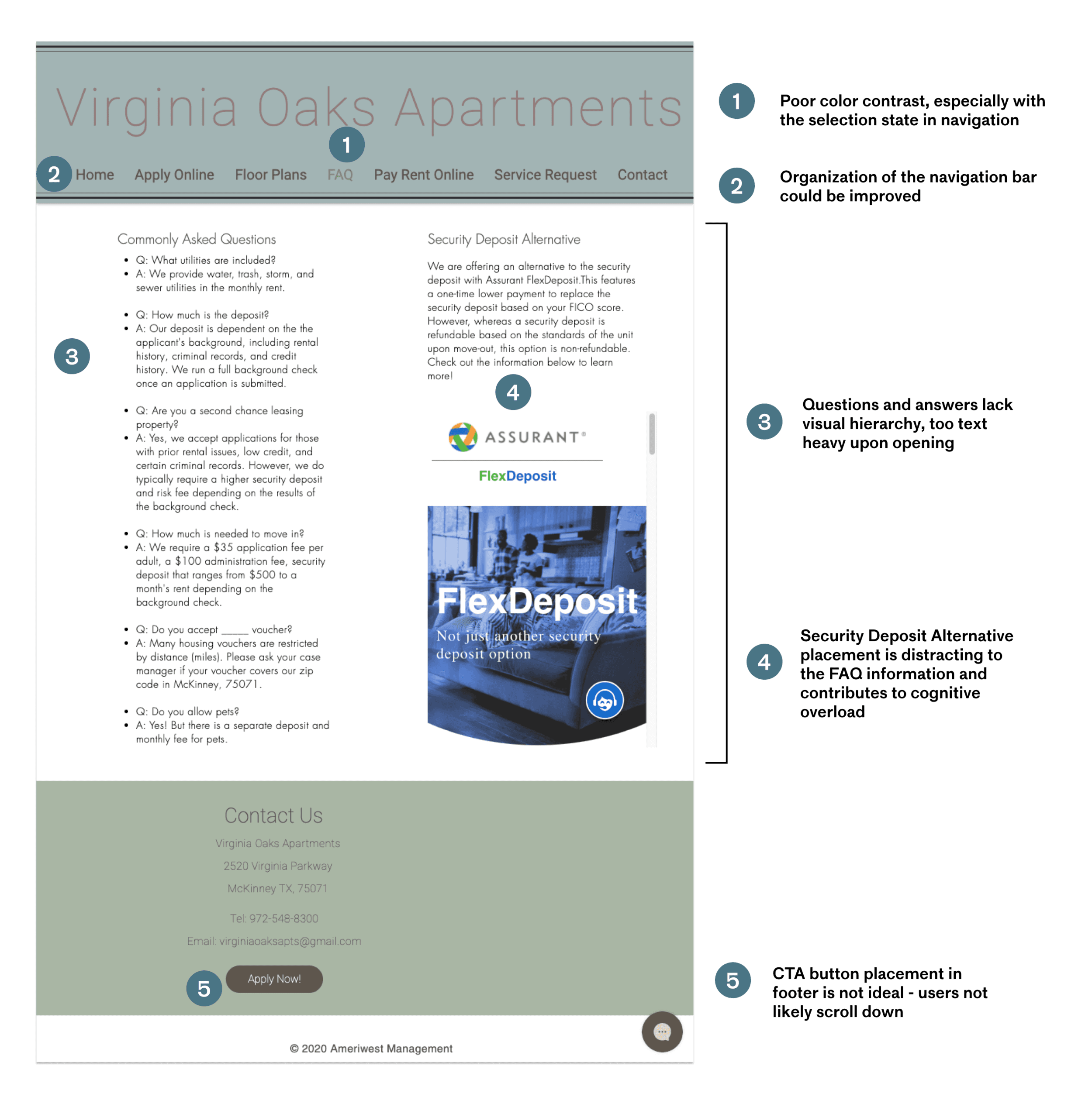
Below is the old FAQ page, which highlighted many of the issues with the previous website.
Conducting user interviews and market research
Our first step was to conduct market research to see what similar low income apartments in McKinney had to offer. We found that most competitors had high quality images, appealing color choices, and a focused brand image. We also analyzed how competitors organized navigation information, and found that many had a community page, which the original Virginia Oaks page did not have.
Next, we compared what we found in the industry to what current apartment seekers experience during the stressful search for housing. We conducting 5 user interviews to gain insights on what users’ needs, goals, and pains are when looking at an apartment website. One barrier we experienced was being unable to interview low income residents in McKinney, Texas, because of the location difference.
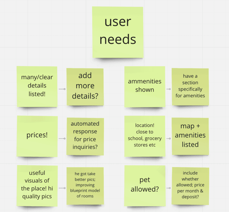
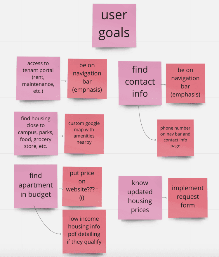
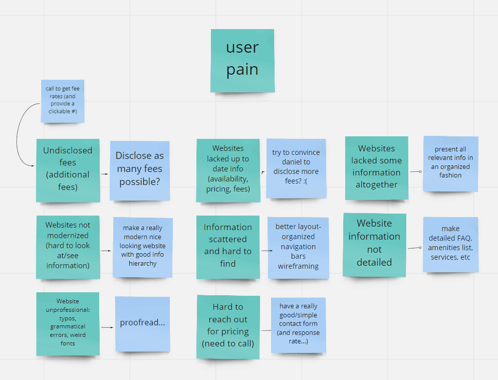
To summarize our findings, we found that users' key needs and goals are to:
Contact the company easily
Find information related to amenities and logistics on the website with ease
See where the apartment is located in relation to the community
Mapping out the site structure
Sitemapping
With the brunt of the user research completed, we moved on to drawing sitemaps and narrowing down the semantics of the navigation bar. We wanted to create page specifically for amenities in the area, as it was something mentioned often in the user interviews and appeared in the market research as well.
To create a flowing experience, we ordered the navigation bar to move in the order of the features users found most important to their decision process.
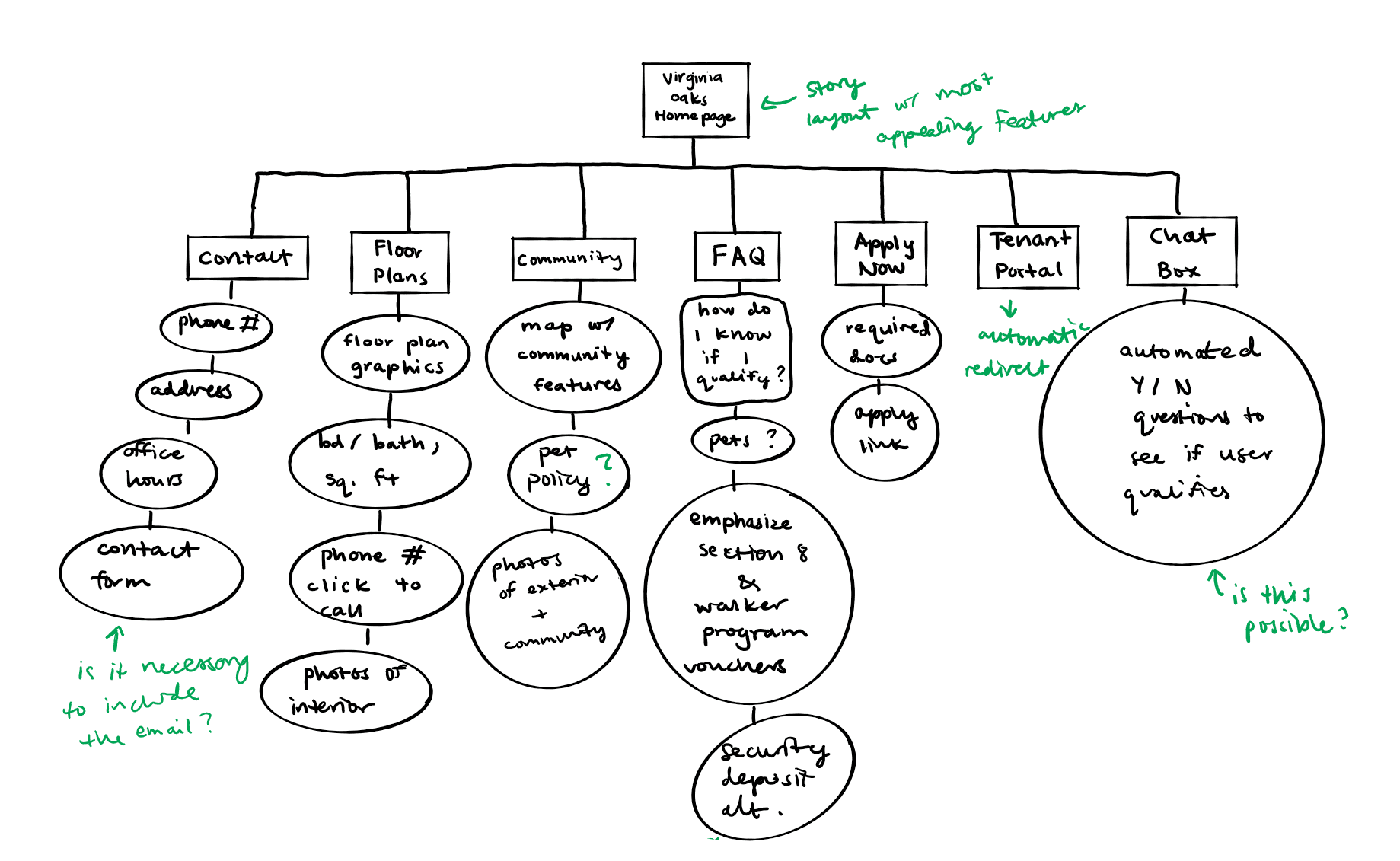
The final iteration of the sitemap I proposed to the team.
To validate our finalized sitemap, we conducted a card sorting task to decide where to put which told us where users would look for certain pieces of information, and if there was any confusion with how our navigation bar was organized.
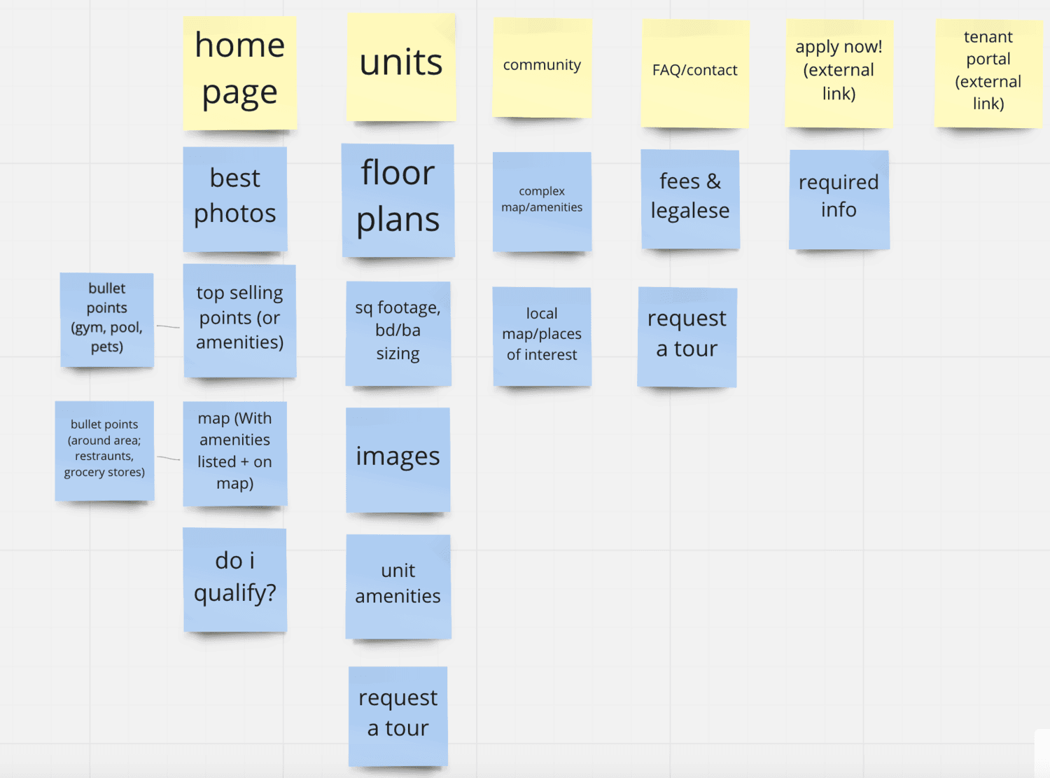
Iterating on wireframes
I created low fidelity wireframes to structure the information for the FAQ, Community, Units, Contact, and Application pages.
In creating the wireframes, my main priority was ensuring that the desktop designs would work well on mobile. I focused on simplicity and blocking information in digestible chunks.
Iterating on wireframes
To ensure that everything would be implementable on Wix, we transitioned the prototypes on Figma to Wix and made changes in the editor. Once in Wix, we realized some features or designs were not possible to implement, so we made adjustments accordingly.
Visual identity
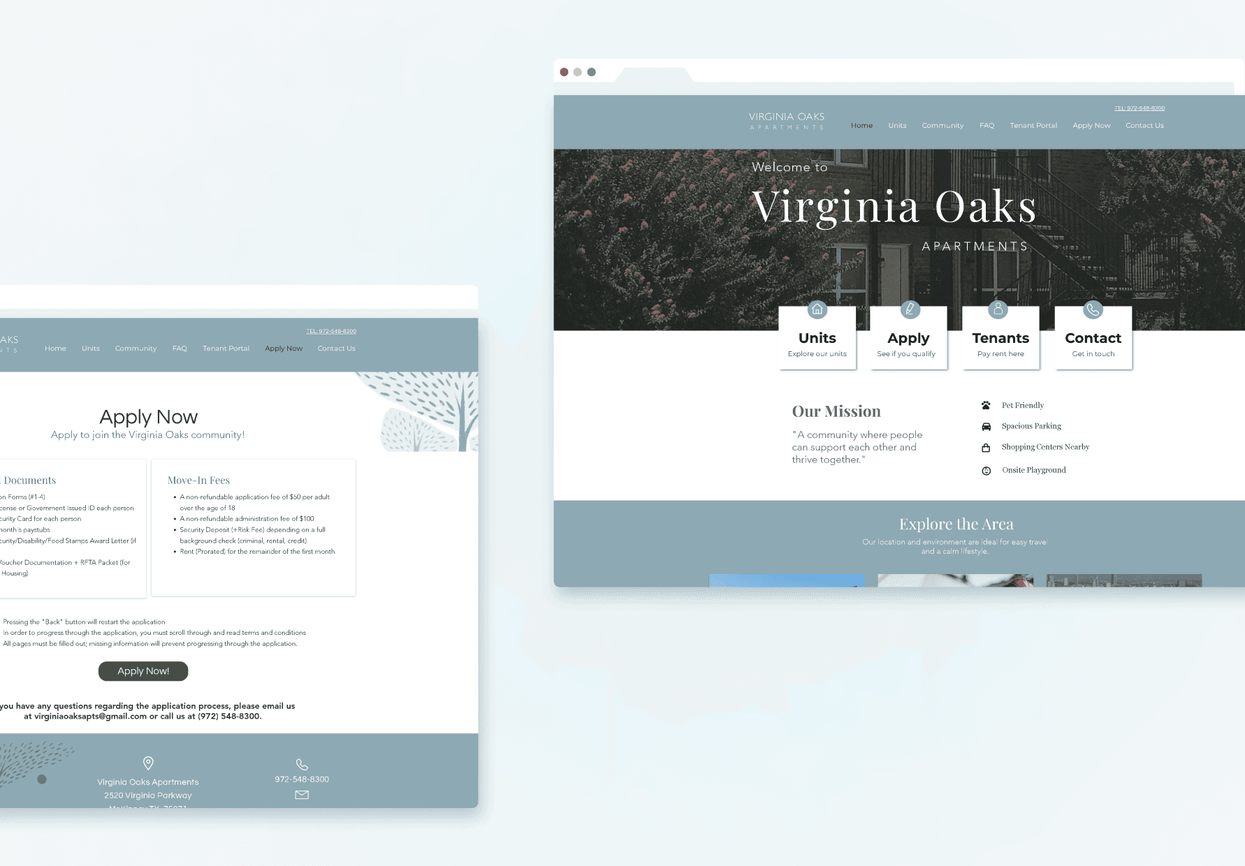
We iterated different visual branding styles. In align with the client's request for a cool-toned, modern website that fosters a sense of community, we decided on the resulting design
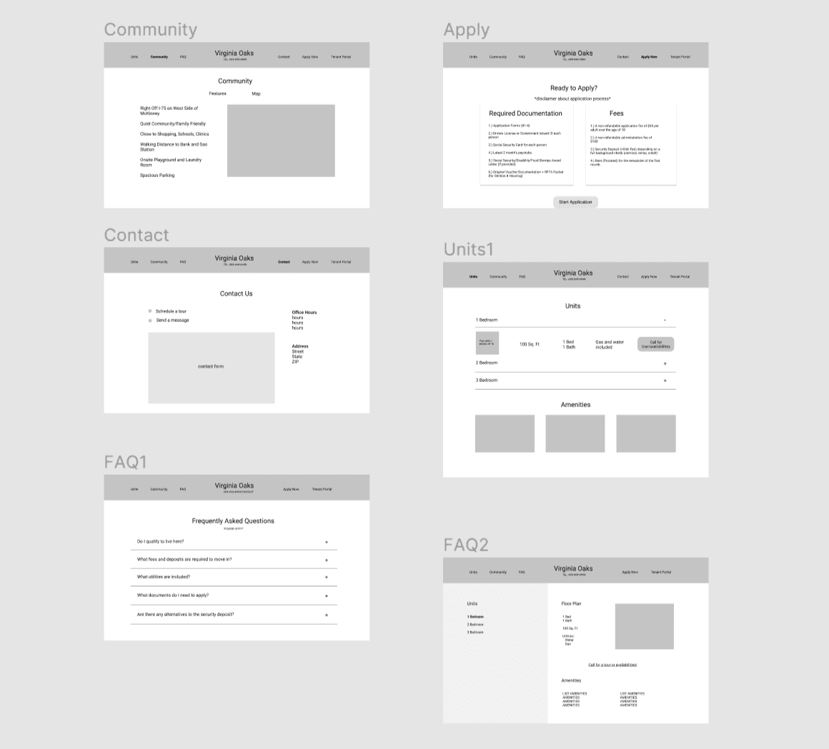
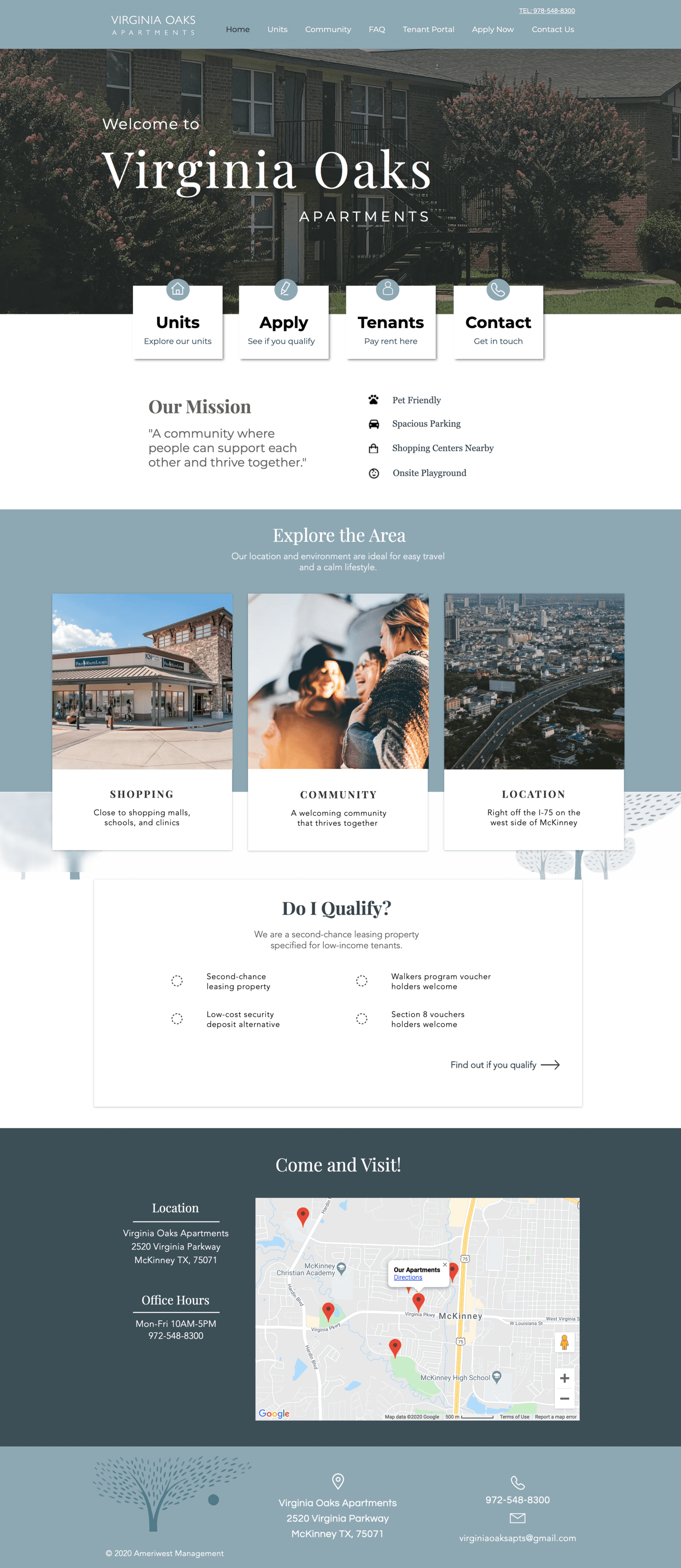
Final designs
Results
The website saw an increase in unique site visitors by 175% and the overall visits by 66%.
This was after implementation in the following four weeks. It was incredibly rewarding to see the immediate benefits of a redesigned website.
Results
One of my biggest takeaways from this project is how important information architecture is. Apartment hunting is frustrating. When users cannot easily obtain the information they need to make a decision, that roadblock may lead users to go with a simpler solution. Instead of overloading users with text, I learned how important it is to organize that information and provide it in digestible chunks.
Special thanks to Jennifer Suh, Chris Chan, and Robert Perez for mentoring us and sending us great articles.
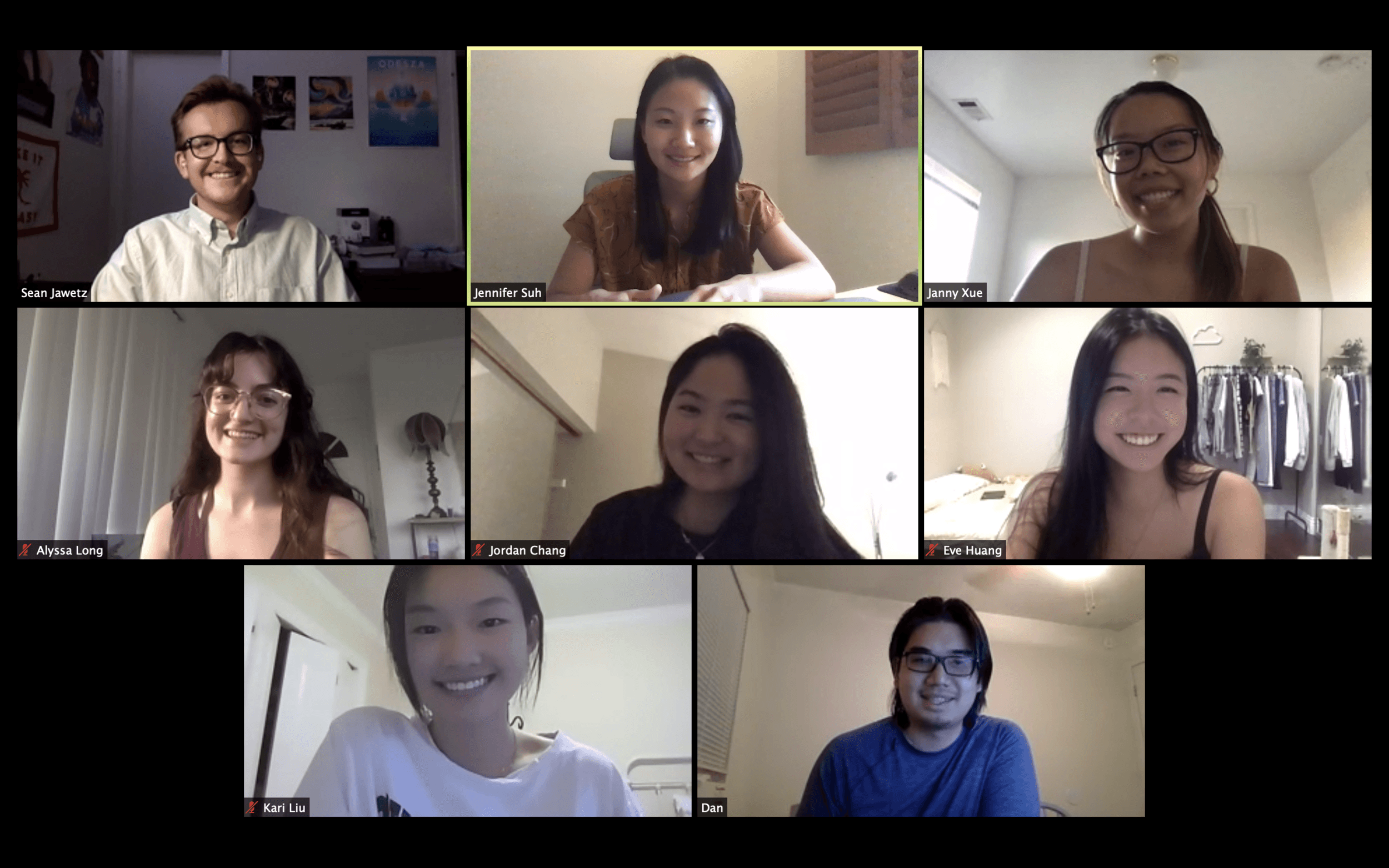
The team + our mentor Jenn and our client Dan!