Supergrain, 2022
Detecting errors within a messaging funnel workflow
My role
Product designer
Skills and tools
Figma, interactive design, prototyping
Problem space
B2B SaaS marketing
Duration
6 months
Overview
About Supergrain
Supergrain is a B2B marketing automation tool built for marketing teams responsible for creating workflows and running action triggered campaigns. I worked as the sole product designer for Supergrain’s web app, where I established the core design system and developed key product features.
What I did
I worked on various projects across the entirety of the app throughout the 6 months I was at Supergrain, and spent about 2 months developing the workflow experience enabling marketing professionals to craft messaging funnels utilizing our boolean logic. This project is apart of the workflow experience effort, in which I developed an experience for detecting errors within a workflow. I made a visual system for node states, delivered animated prototypes, and collaborated cross-functionally with multiple stakeholders.
Collaborations
I continuously communicated with the CEO to update him on my progress and proactively sought out feedback to ensure that I was meeting product and user goals. I checked in with software engineers Katherine Hennes and Ryan Liu for engineering feedback to identify any limitations or restrictions and proposed solutions to any roadblocks. I also received creative feedback from weekly design critiques with my design mentor from Upperstudy.
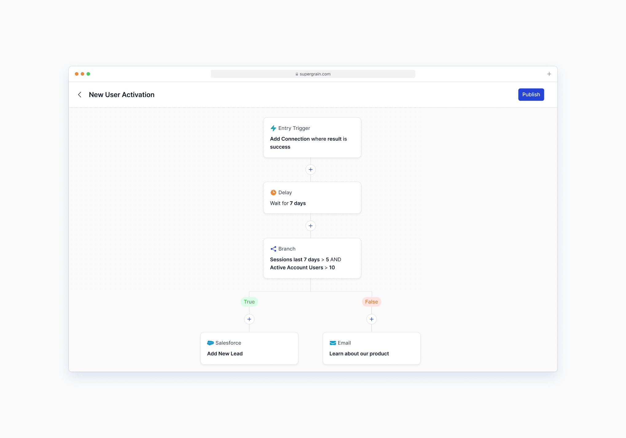
Workflows are prone to errors
The Workflows experience is a technically complex feature that can get unruly quickly. Marketers often build workflows that span dozens to hundreds of nodes, each with their own conditions and inputs.
🎯 The challenge
How can we help marketers keep track of their errors and resolve them as they build their messaging workflows?
Understanding the problem
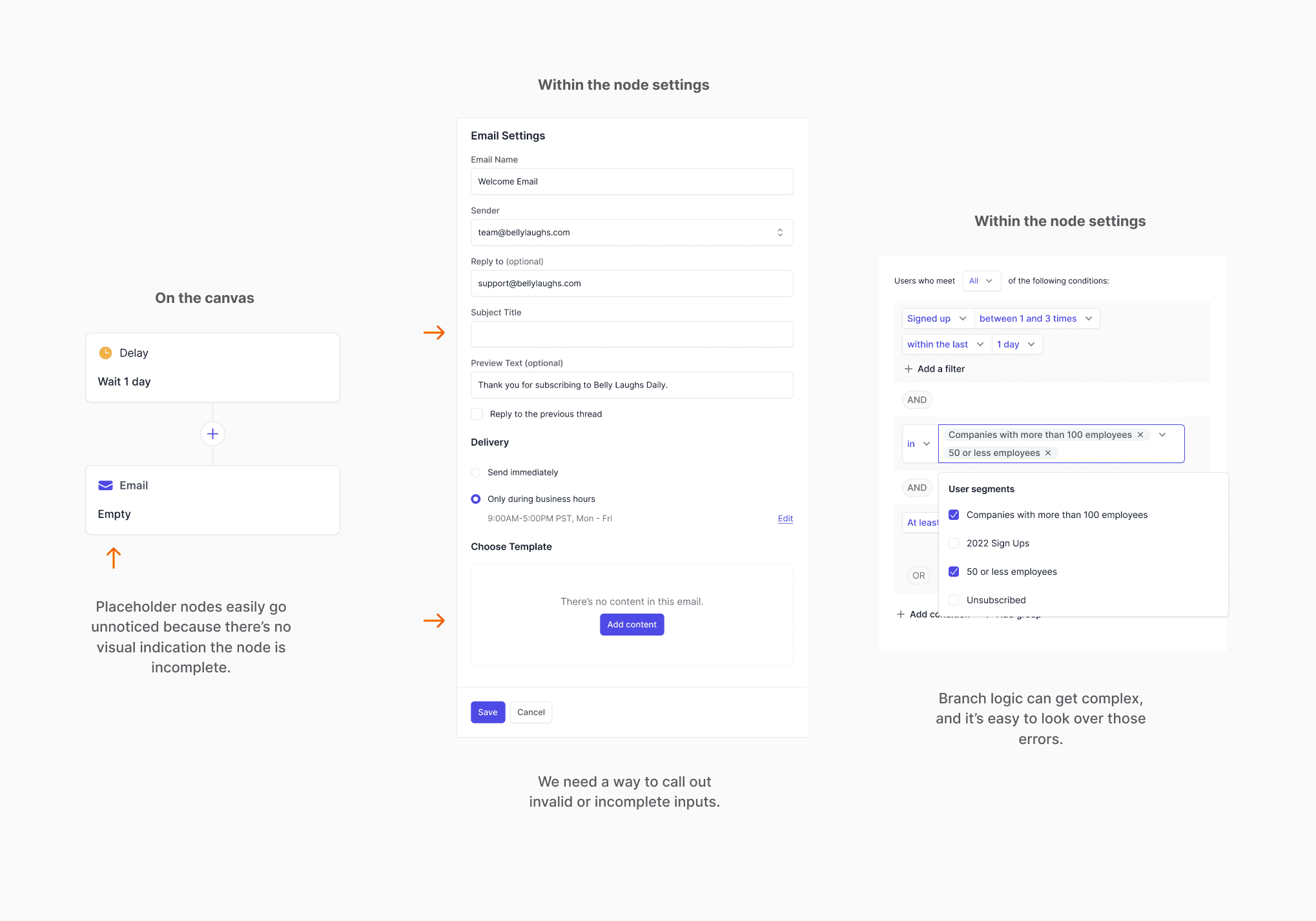
I wanted to better understand the root of the errors before diving into designing. From observing our design partners work in our product, I found that they usually couldn’t publish their workflows because:
They didn’t have the email for that part of the workflow ready and intentionally used the node as a placeholder
They passed over a required field
They created a condition that wasn’t executable
Starting to sketch out the flow
I researched potential flows for detecting errors before jumping into my own design process. I researched common visual patterns of alerts and showing incomplete items from apps marketers are familiar with, as well as general error display solutions.
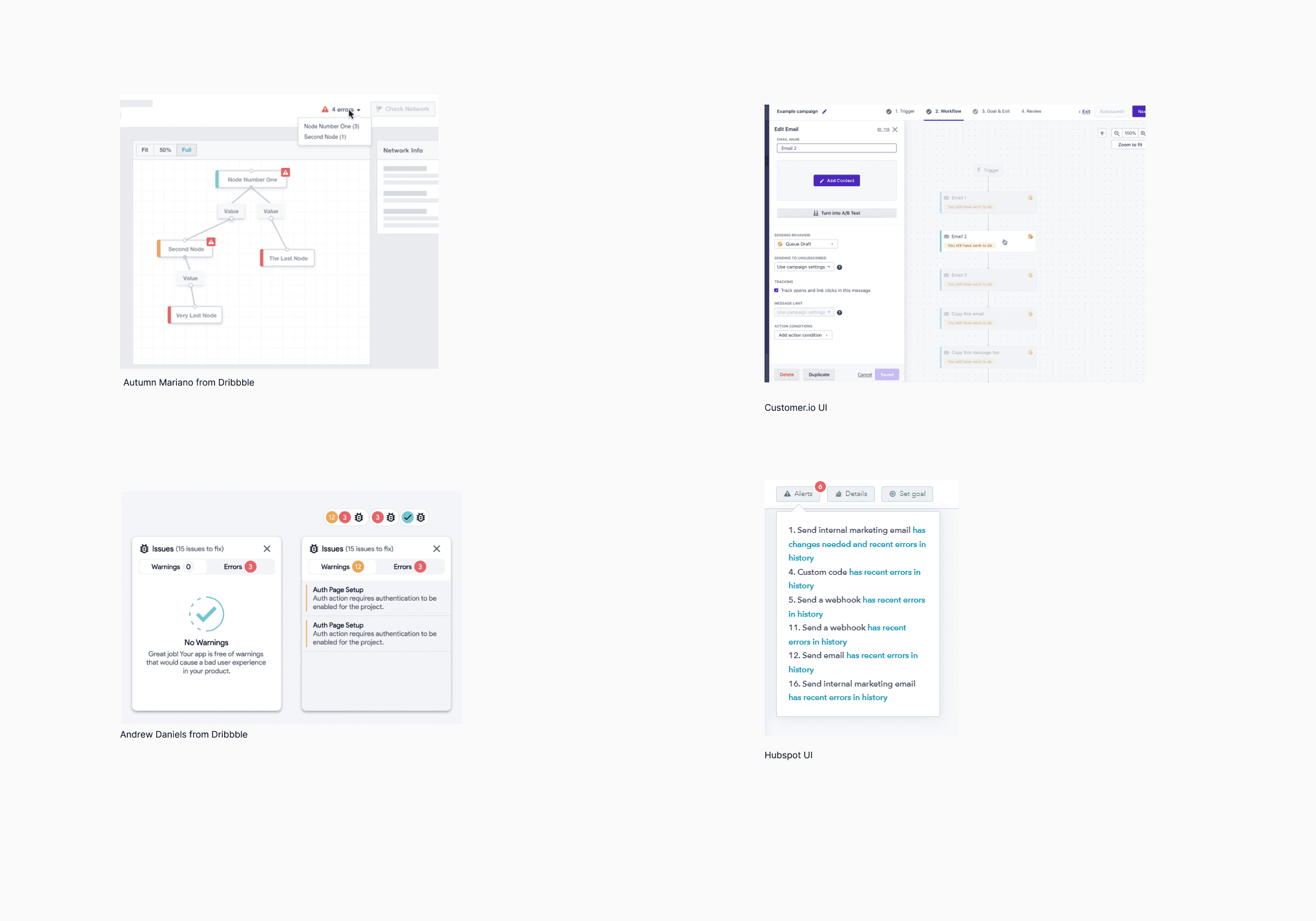
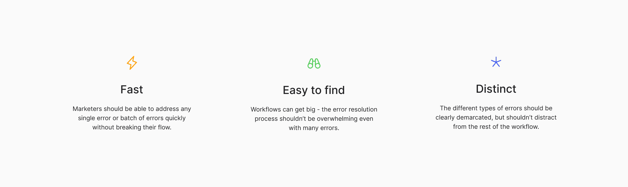
Takeaways and design questions
Not surprisingly, red, orange, and yellow were the most common colors used to denote errors.
How might we design an error node so that it’s clear there is an error?
How might we provide brief information about the error?
How should the user access all their errors?
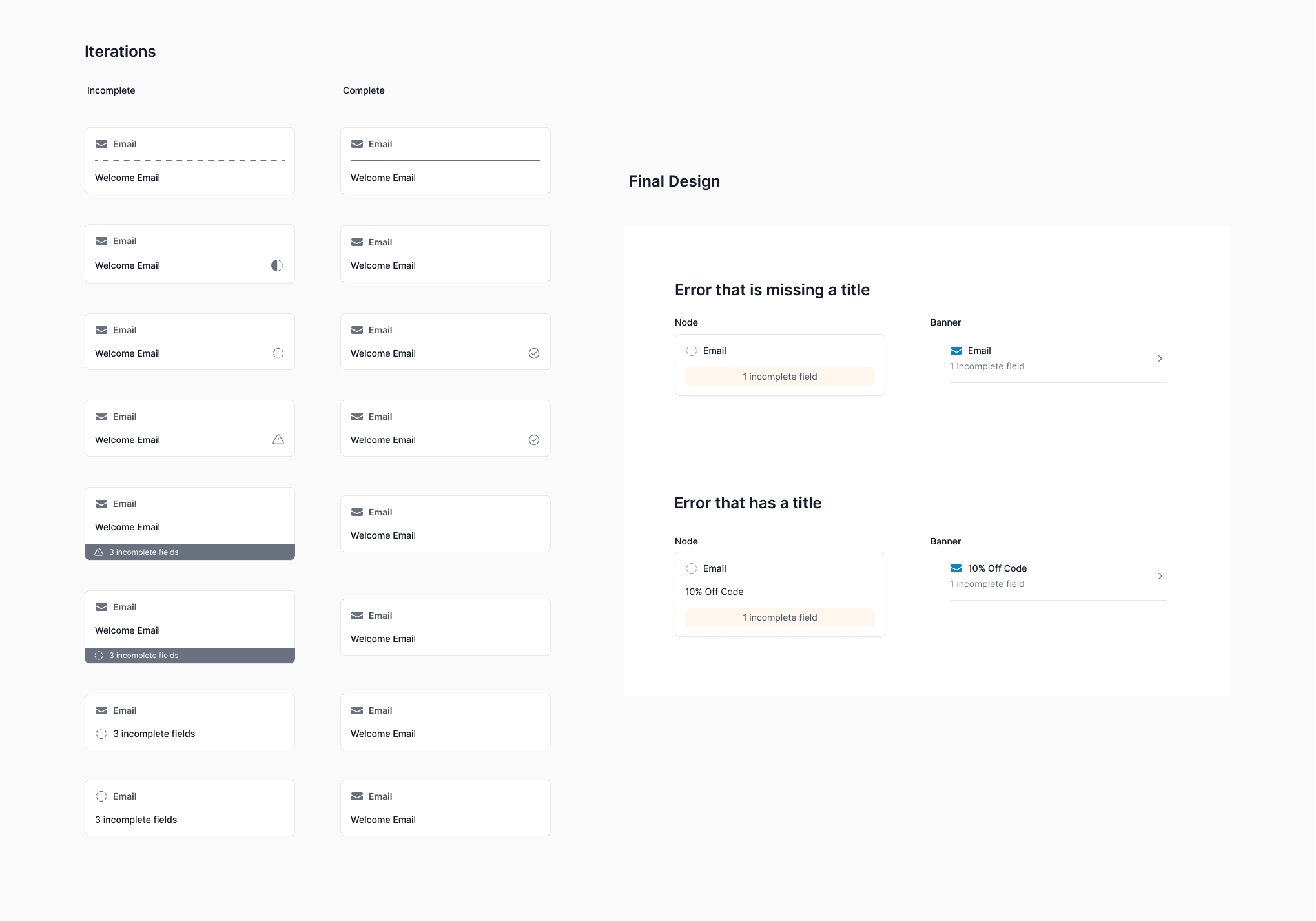
Determining the design of the error state
I refined the design of the error node. I explored various formats for how to display a node with an error, and thought through the different states a node will go through - the state when the node has just been created, versus partially filled out, versus complete, versus incomplete. I had to find the right balance of indicating that there is an error, without making the flow distracting to look at.
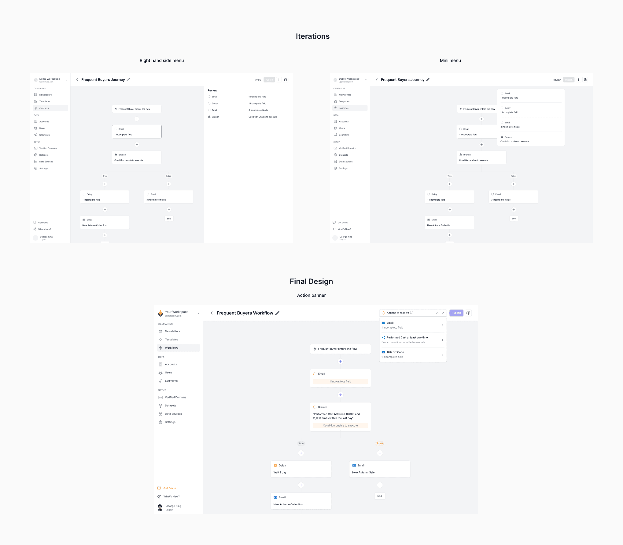
Exploring structure and interactions
I explored different interaction patterns for bringing up errors. Existing patterns worked, but one thing I noticed was marketers zooming in and out around their canvas to find errors manually. I saw an opportunity to design a faster way to access errors with regards to the node's location in the workflow.
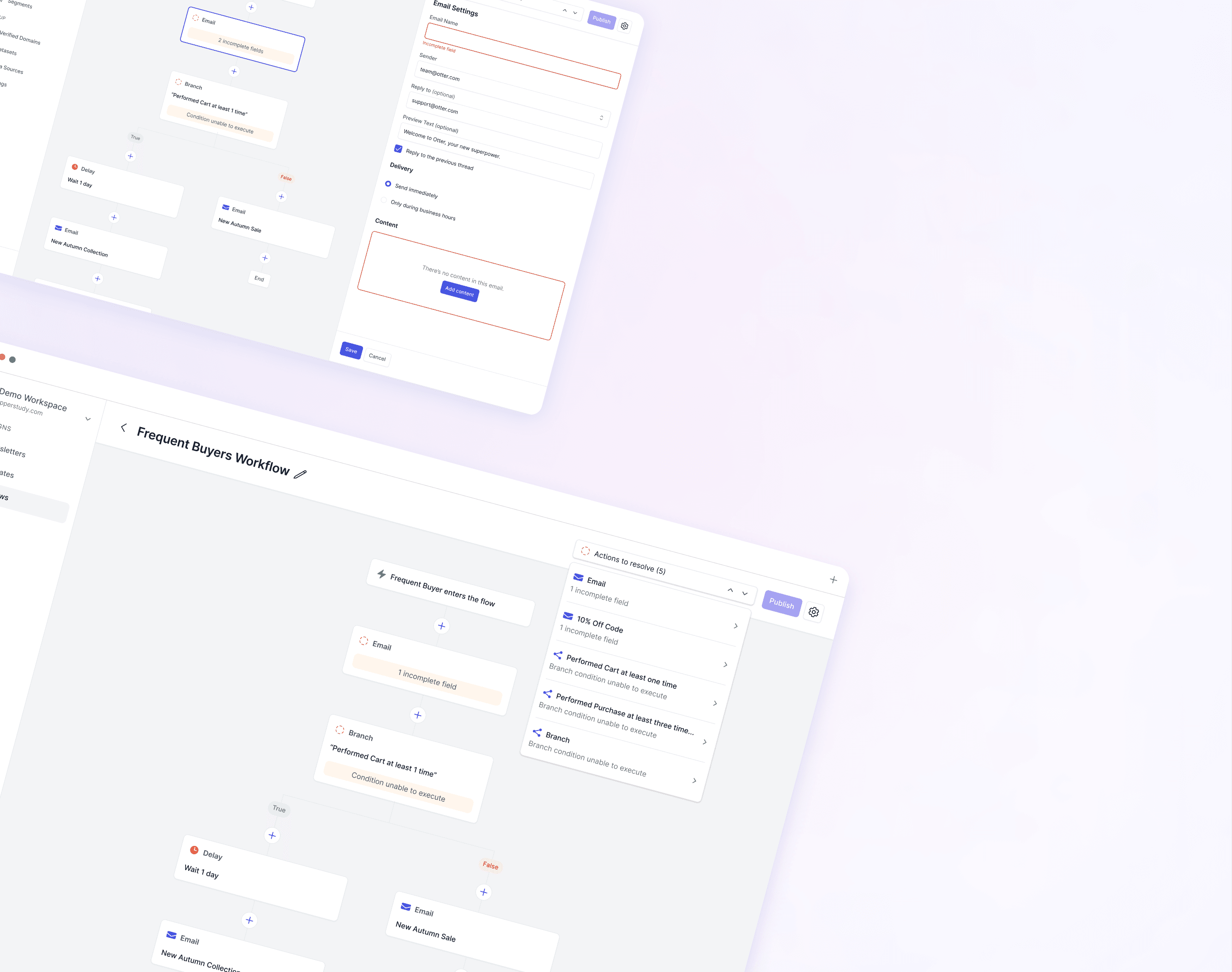
Final design
Identifying the errors
The user can quickly identify which errors exist from looking at the workflow - the incomplete icon, yellow caution color, and messaging all provide context to what the user needs to do. The user can click into the node directly to resolve their errors.

Cycle through errors quickly
The resolution banner provides users quick insights to the error they’re solving. Users can cycle through quickly to find the error they want to resolve, which will take them to the spot in their workflow where they have errors.

Resolving errors
The resolution banner provides insights to how many errors the user has left. Once the user resolves all the errors on the node and save their work, they’re automatically brought to the next error.

All errors resolved
The resolution banner disappears and the user is free to publish!

Learnings
Unfortunately, Supergrain soon after pivoted into a different product direction so I was unable to receive more user feedback on product features I had implemented. However, through my time working on a startup with a team of 7, I learned so much so quickly.
This project allowed me to practice critical thinking, attention to detail, and human-centered design thinking to consider all the useful features I could add to such a simple tool. I sought opportunities to experiment with novel interactions and patterns and explore edge cases that were not initially captured in the project brief.
Thinking outside of the box
I was excited to apply a design pattern commonly used to find key words “cmd+F” to a novel use case - error detection. It was fun exploring a range of simple to more complex ideas.
What seems like a simple task can have so much complexity to it.