HG Insights, 2021
Designing for a data marketing dashboard
My role
UX Design Intern
Skills and tools
Figma, user research, prototyping
Problem space
B2B SaaS Marketing
Duration
6 months
Overview
About HG Insights
HG Insights is a data company based in Santa Barbara that focuses on delivering technological insights to help marketers target the right companies based their technology stack. When I joined in 2021, the company was growing exponentially and faced a need to make their main product, the HG Insights Platform, better equipped for self servicing its users.
What I did
As the sole UX Design Intern on the Product team, I worked closely with my manager, who was the sole Product Designer, to define the details of the features I was working on. I created sketches, wireframes, design flows, and high-fidelity prototypes for these features. I also led my own user research efforts and collaborated with engineering and product management to ensure I was meeting user and business needs.
Project 1
Bridging the gap between old and new
HG Insights has rich taxonomical data that helps to map out the categorizations of their located within one of their previous products, HG Discovery. We have an opportunity to bring this data into the Platform so that our users may better use this information to help understand a company’s tech stack.
Problem statement
Users don’t understand the way we define our spend and product categories, which are essential to understanding how a specific company is allocating their budget and which products they're spending on.
To find out more, users often contact customer success for clarification or reference other resources, which is time consuming and inefficient on both ends.
🎯 Our goal
How might we design an experience within the new platform that enables users to explore our taxonomies and enhance their discovery of new products?
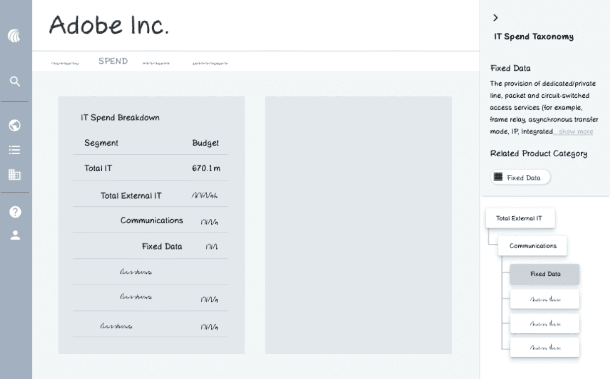
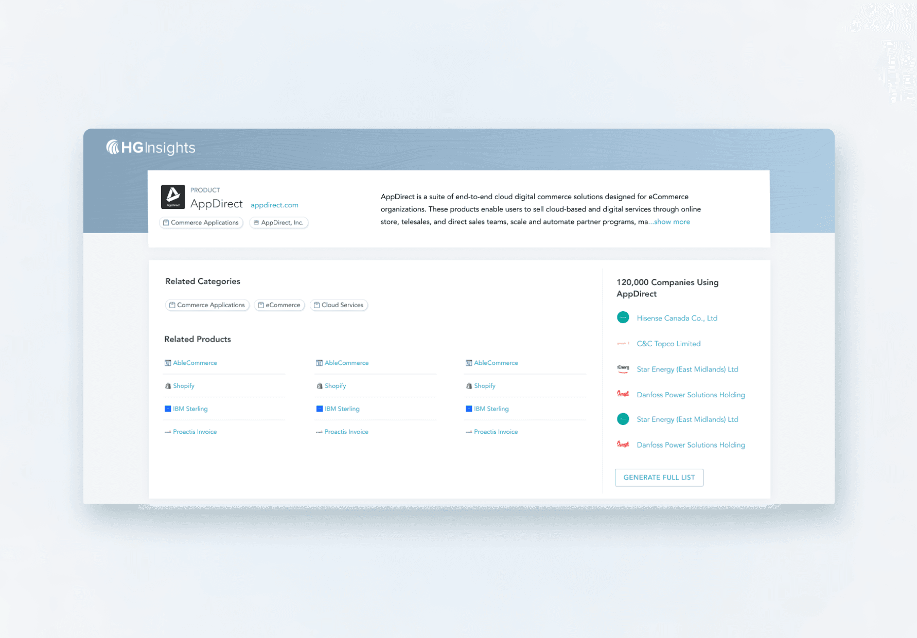
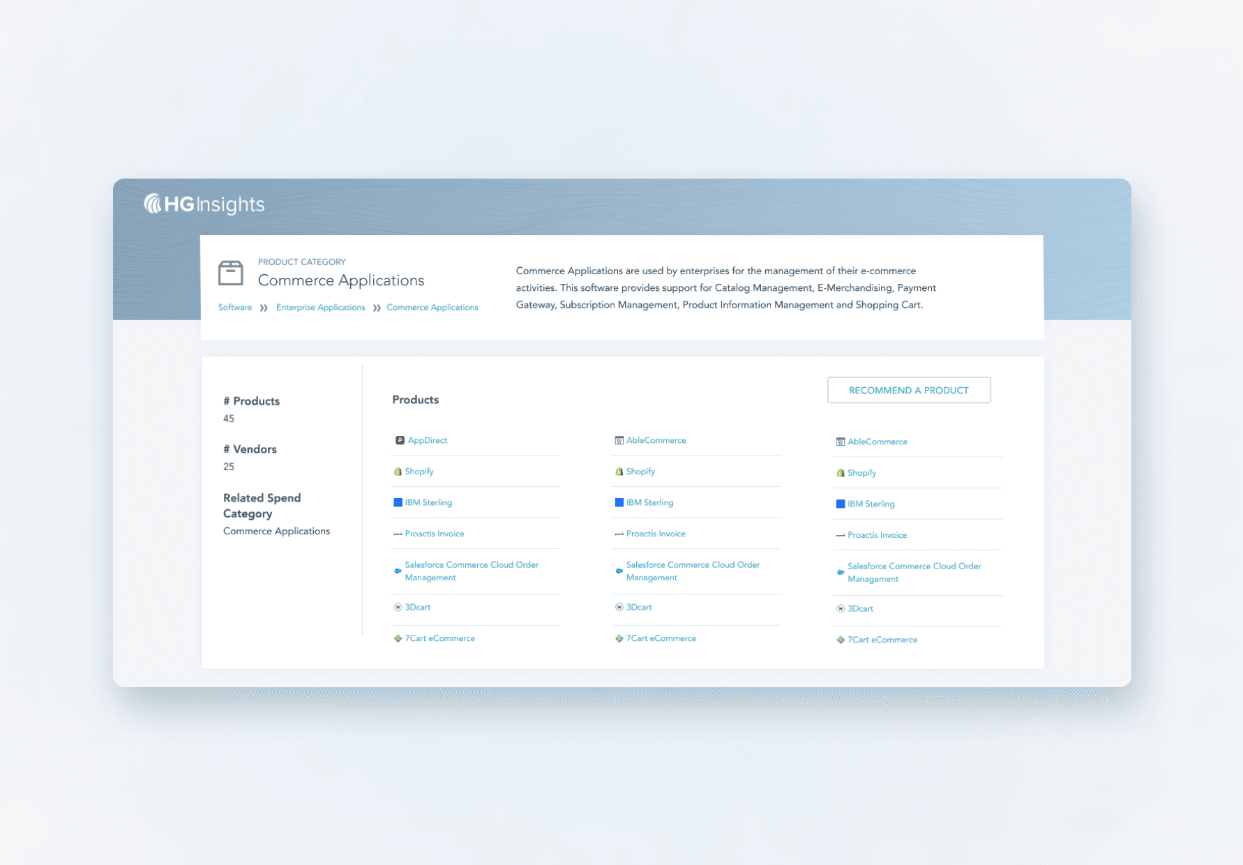
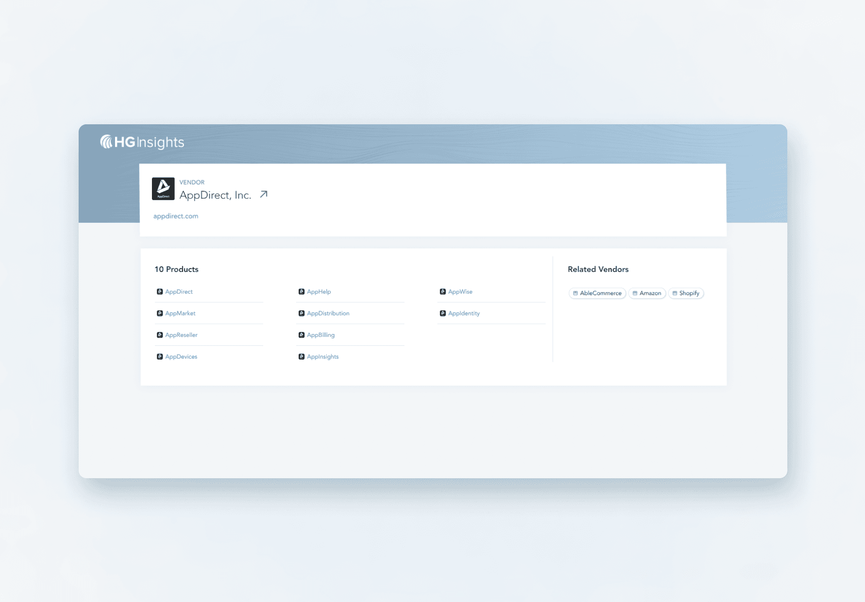
The current state in our main platform
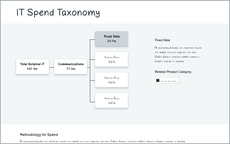
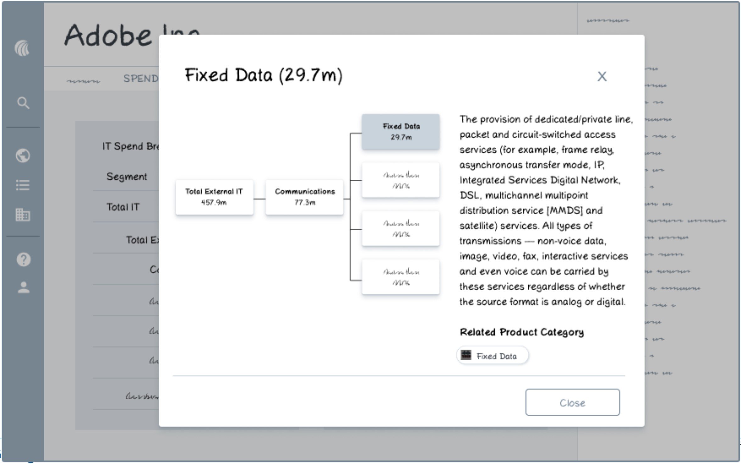
The extent of the current taxonomy in our main platform includes breadcrumbs to help users understand how product categories are nested. Descriptions for each spend category is provided on hover.
The existing education within the platform is lacking a cohesive experience. This is an area of opportunity to unify some of this information and enhance the meaning with visual representations of the taxonomy and additional information about product and vendor categories.
What's the structure?
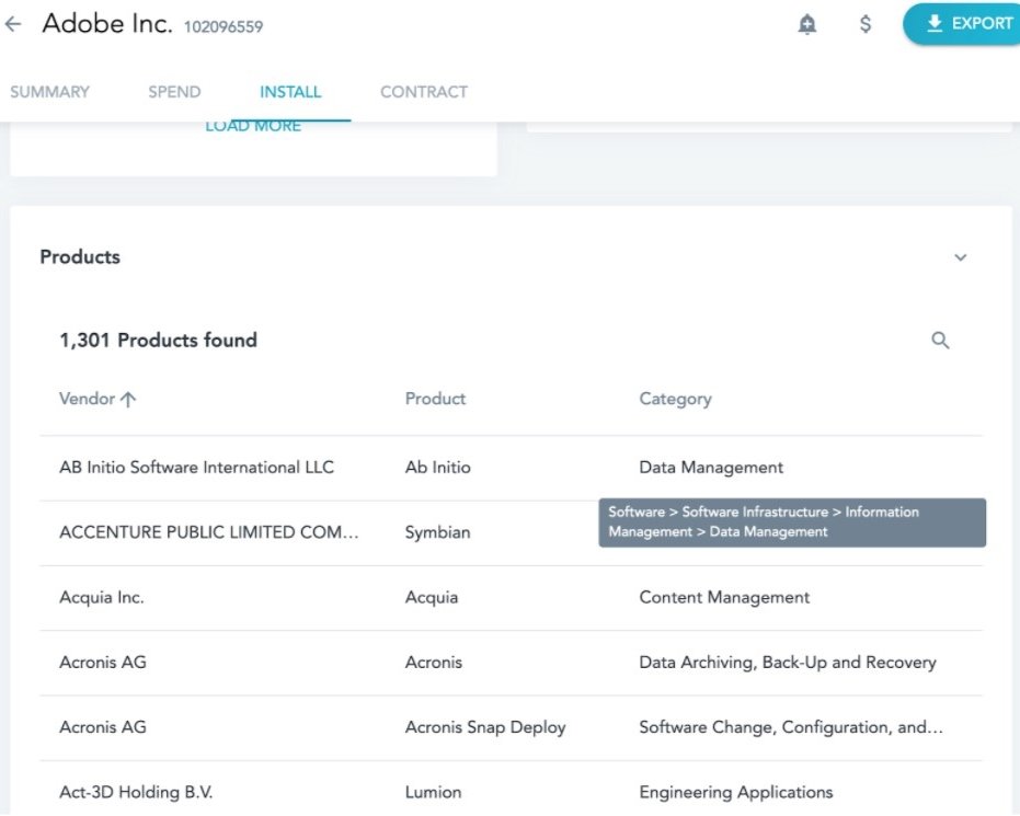
There are two types of information to surface onto the platform:
Visualizations for the structure of the spend categories and definitions for HG’s spend categories
Various details about specific vendors for products, the products, itself and how those products are categorized.
To simplify this for the sake of the case study, I will be referring to the two types as spend information and product information.
Research
To answer this, I brainstormed some questions to guide my design research:
What kind of design experience fits the workflow of how customers want to explore this information?
Modal, sidebar, full page, etc
How would a user want to progressively explore information?
What visualizations are most helpful for understanding the taxonomic structure for spend
Sunburst chart vs. tree chart
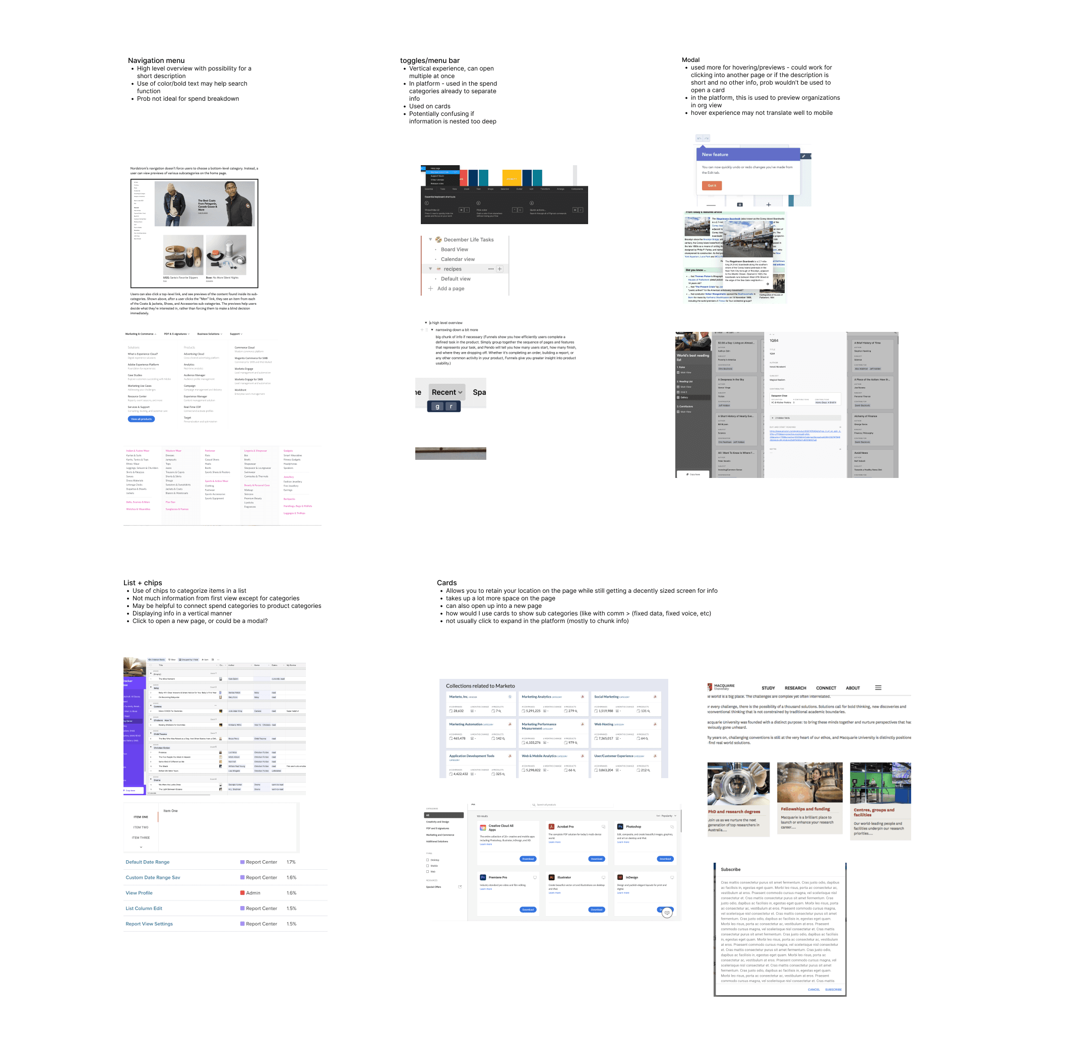
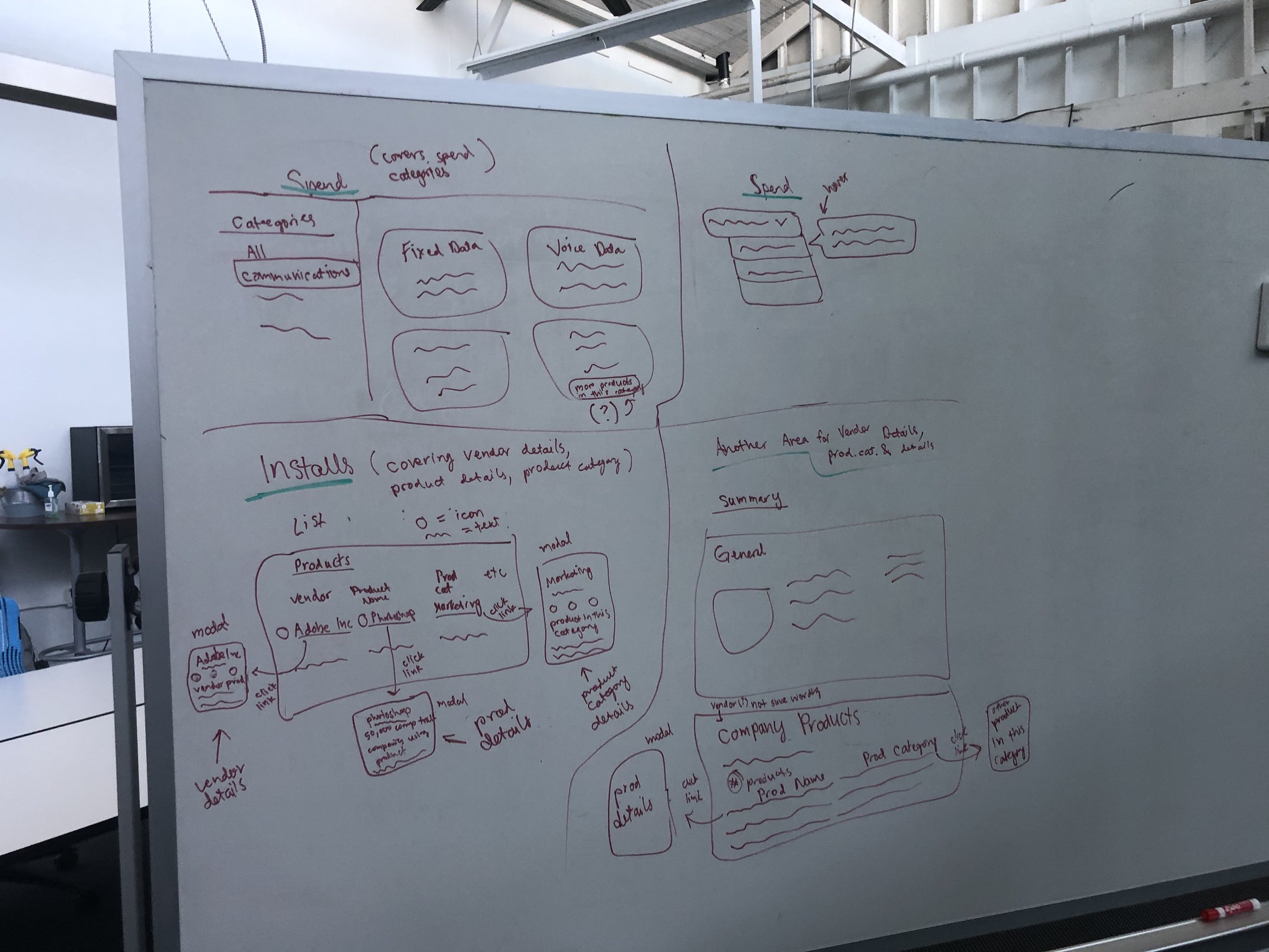
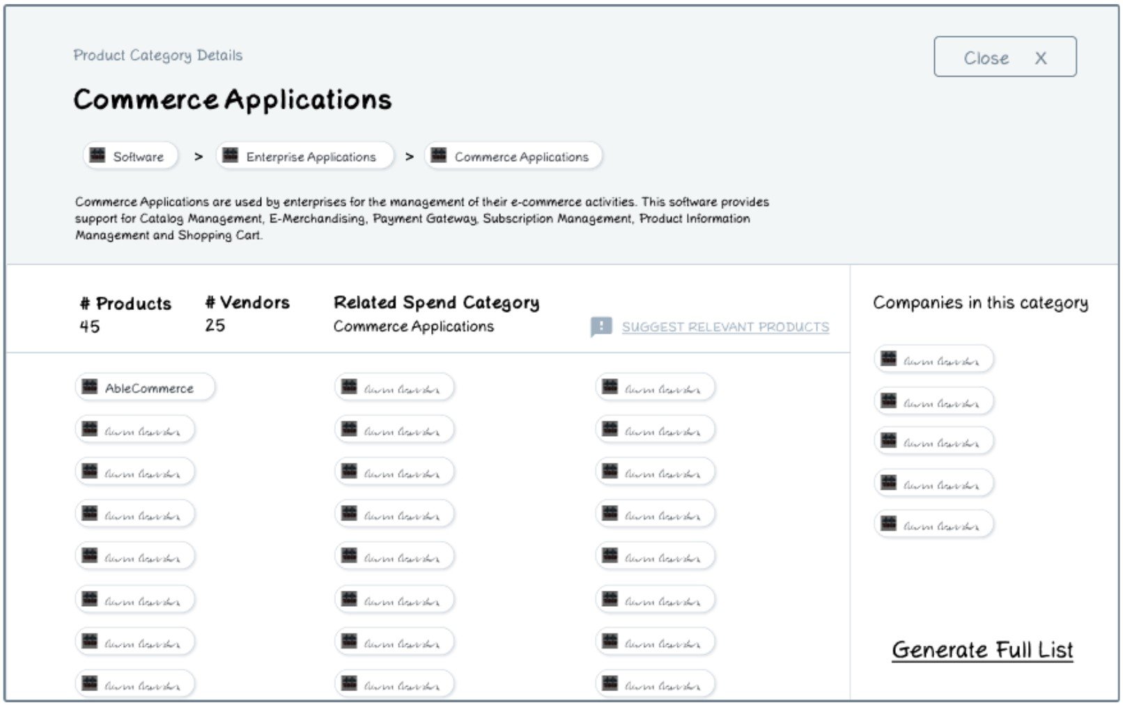
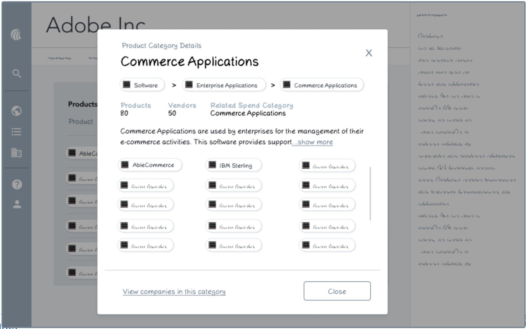
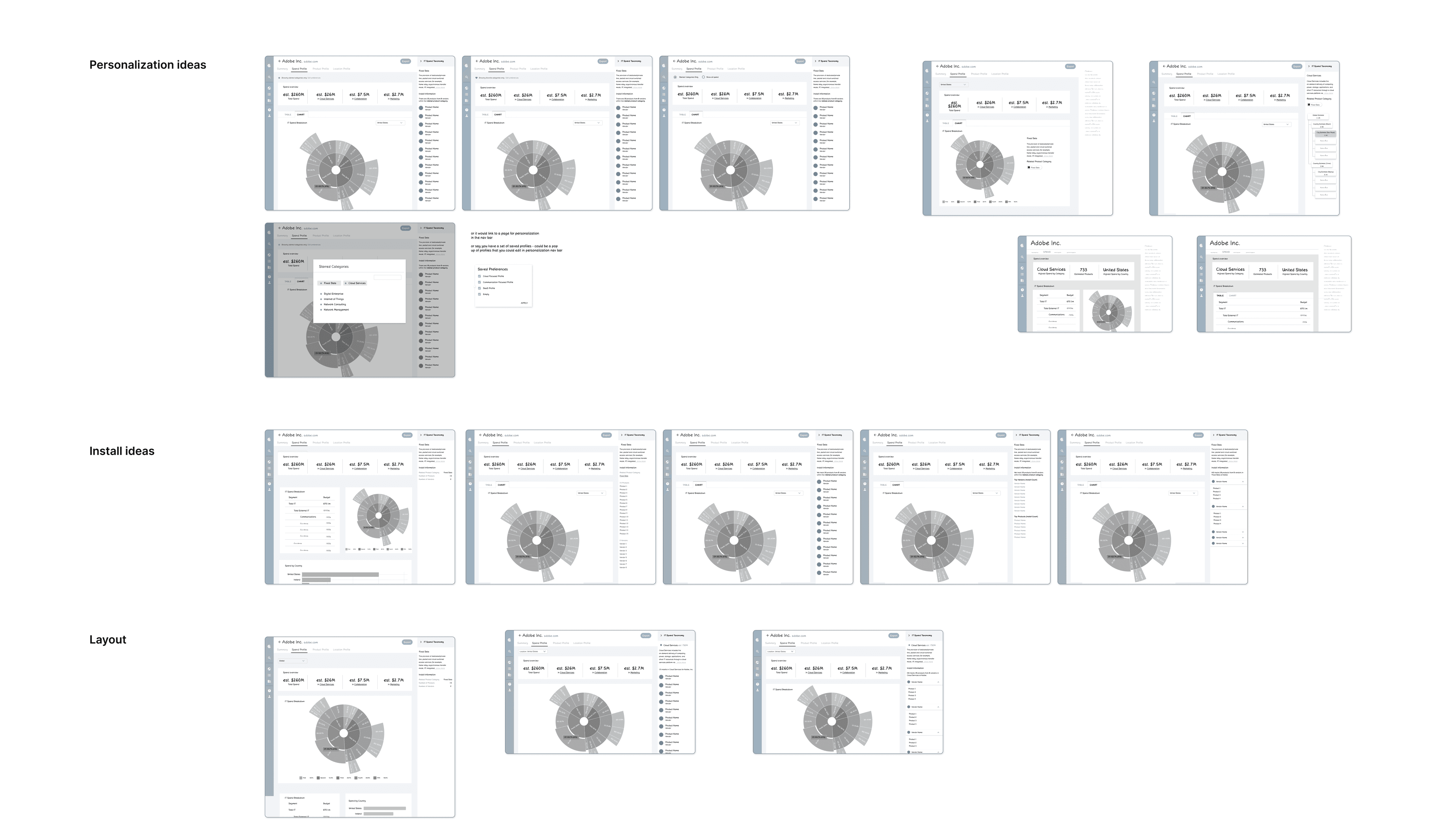
Design iterations
After researching common design patterns on how to nest information, I narrowed down a few iterations for spend information and product information to test out with users. Each variation had its own implications and trade offs for how it fit into the work flow, so it was important to get feedback before iterating any further.
I connected with 5 internal folks for 45-60 minute sessions for user testing.
I found that:
The sidebar is strongly favored for spend for its smooth workflow integration
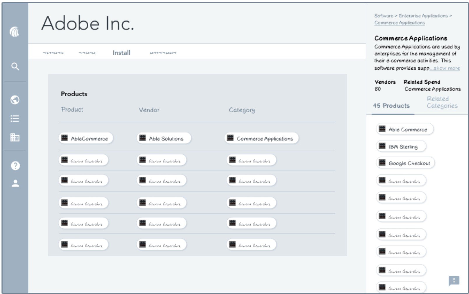
Full page is favored for install for ease of viewing and discoverability
When information is viewed within the page, it’s interpreted as contextual
When information is viewed as a separate page, it’s interpreted as universal
Sunburst chart was favored over the tree chart for its unique look
Product suggestion experience was positively received because it shows customers we care about their feedback
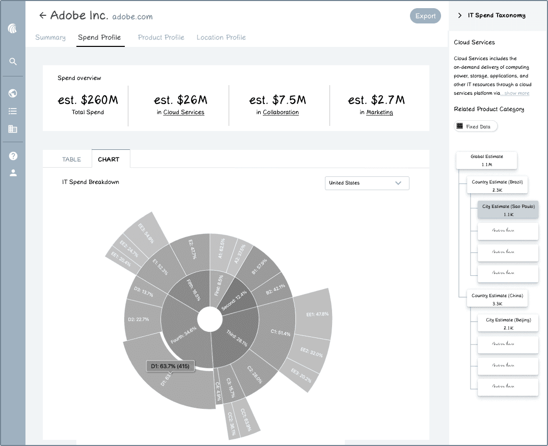
Final considerations
We were testing out how to show information about each product, product category, and vendor. The full page was found to encourage the most discovery and provided the most breathing room, which is fitting because this use case requires a bit more in depth searching. I was unable to test the product suggestion experience further due to time constraints, so I decided to exclude that part from the experience. If I had more time, I would have developed that area further.
Final designs
We were testing out how to show information about each product, product category, and vendor. The full page was found to encourage the most discovery and provided the most breathing room, which is fitting because this use case requires a bit more in depth searching. I was unable to test the product suggestion experience further due to time constraints, so I decided to exclude that part from the experience. If I had more time, I would have developed that area further.
Project 2
Redesigning the company view of spend
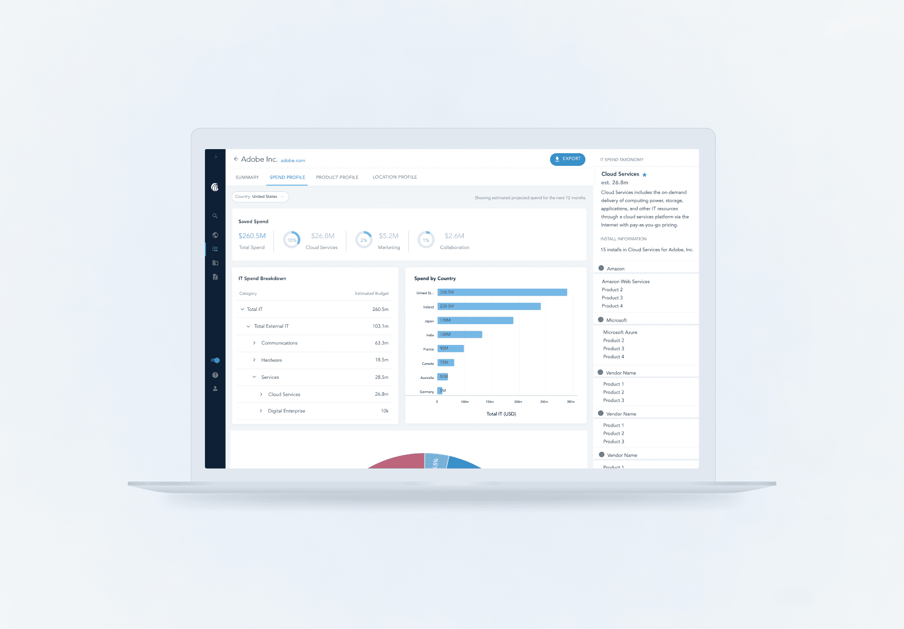
With changes to the company’s underlying data, there is an opportunity to make the company spend page more robust with its features so users may personalize their spend page for a more efficient and self serve experience in Platform.
Functional requirements
I worked with the PM for this project, Ankita Pawar, to understand the needs of our users and goals we have to making the company spend page self-service.
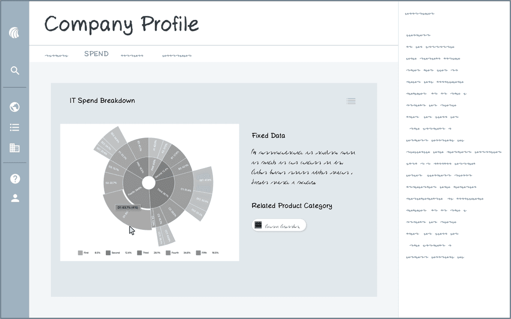
We see an opportunity to make it easier for users to understand the shape of our data with better visualizations
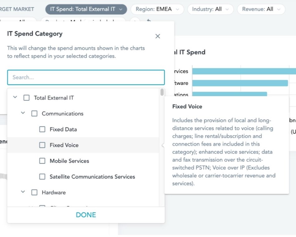
Users want to be able to save spend categories relevant to the categories the user is in - we have 100+ categorizations, but most users will only need to see a select few
We want to give users access to our data dictionary to provide context behind each category
We want to map spend categories to install categories, because they're relevant to each other
Challenges
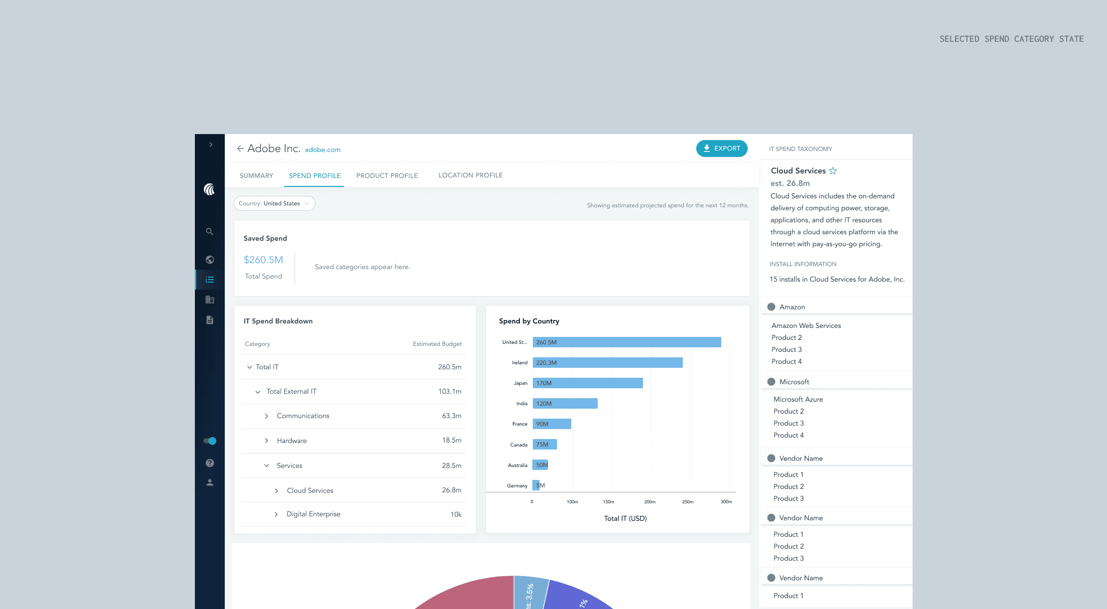
To approach these requirements, I had a few challenges. Luckily, some of the work from my first project provided a good starting point. I already knew that a sidebar would be helpful for viewing additional information about certain spend categories, and that the sunburst chart was the best visualization so far for understanding the shape of data. However, the way to structure information and what to include in the sidebar was still a mystery, and I had concerns on how the sunburst chart would work if it actually contained all of the spend categories HG tracks.
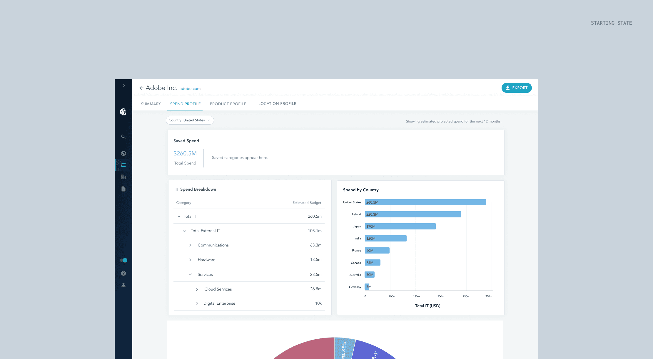
The current UX
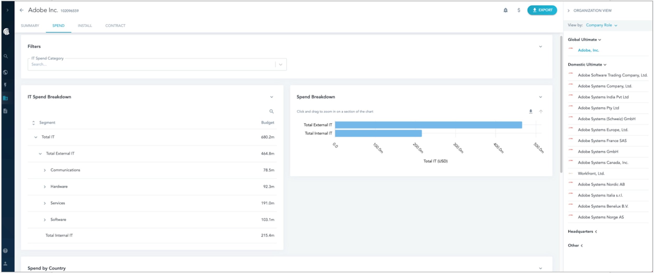
The spend breakdown graph doesn’t add much value and can be confusing for users to use. This led me to ask users what visualizations would be more helpful for the work they’re doing.
The filter by spend category only impacts a subsection of the page (the spend by country section which is not shown), so a way to make that experience more efficient is to filter the page by country or global level spend. This meant I had to consider how filtering by country instead would impact the information on the page.
The current spend page lacks the ability to prioritize important spend categories.
Challenges
To approach these requirements, I had a few challenges. Luckily, some of the work from my first project provided a good starting point. I already knew that a sidebar would be helpful for viewing additional information about certain spend categories, and that the sunburst chart was the best visualization so far for understanding the shape of data. However, the way to structure information and what to include in the sidebar was still a mystery, and I had concerns on how the sunburst chart would work if it actually contained all of the spend categories HG tracks.
Design ideation
I started off with making variations for each of the requirements, so I could separate them out and explore each feature individually before I combined the best options together for user testing.
Testing the concepts
I connected with 2 customers and 3 internal folks for 45-60 minute user testing sessions.
Iteration A
From this first iteration, I had a few findings:
People only care about a few categories - when refining what would go into the overview, I wanted to give users to ability to find their saved categories at the top so they can get those spend numbers quickly.
After talking to the engineering team, I found that toggling between a table and a chart would be difficult to show because of how the page would export - although it was an idea to save space on the page, it wasn’t practical.
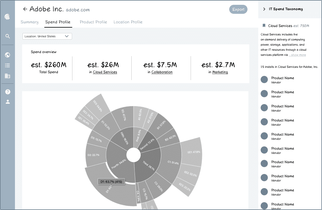
I also found that it’s more important for users to know what a company is spending on for specific categories once they're looking at a specific country, so my idea to have a location level breakdown of a spend category was not the best use of the sidebar. Instead, it would be better suited for showing what products are within this category so users may conduct wallet share analyses.
Iteration B
A few more iterations along the way:
I found that users want to be able to see the spend for specific categories against the total spend by percentages - this is something they do by themselves already, so finding a way to include that into our platform would add a lot of value.
For the sidebar displaying the products related to this spend category, users usually want to see the products grouped by the vendor - the current format is redundant.
I found that users preferred to see the table overview of spend first instead of the sunburst chart because the sunburst is visually heavy.
I also got feedback that the sunburst chart is an interesting visualization because it can show the hierarchy fully, but there was hesitancy about how the sunburst chart would actually look.
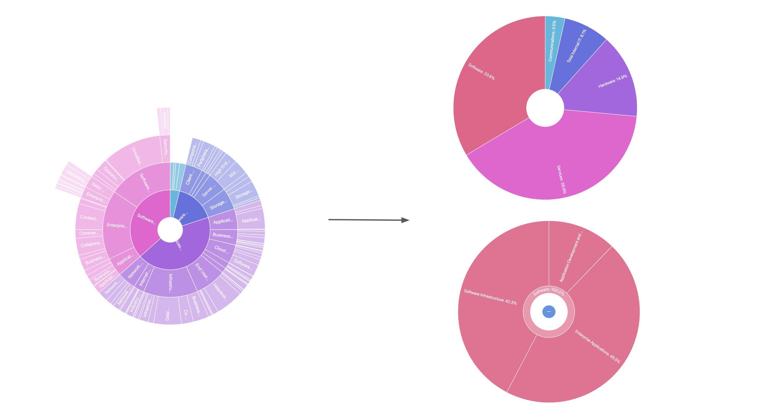
Is the sunburst chart practical?
After coding out what the sunburst chart would look like if it actually contained all of HG’s spend categories, I came to the conclusion that it is not a practical visualization. I opted for a drill down sunburst chart instead. Although it doesn’t paint the full picture of a company’s spend categories, it still provides useful visual context about how those categories are broken up.
Final design

Final reflections
This project was exciting for me because I got more in-depth experience working with engineers and testing with customers. It was especially interesting working on this project because there was a lot of groundwork laid out for it already. It put into perspective what collaboration in the industry is like and I learned more about project handoffs.